Click on images for higher resolution pop-outs. Navigate as a gallery in pop-out mode.
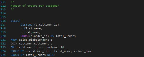
The following images range from T-SQL code for DDL, DQL, DML, TCL, and analysis to BI dashboards for visual analysis. I'm presenting this in the most linear fashion possible to show the process from building out an OLAP database to visualizing the data for stakeholder consumption. My tools are Excel, SQL Server Express, and Power BI. And all code and visualizations presented below are of my own work, save for one date dimension table which is credited below.
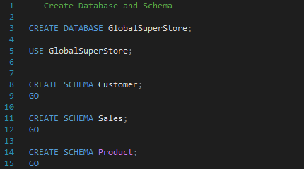
Database and Schema Creation
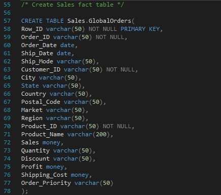
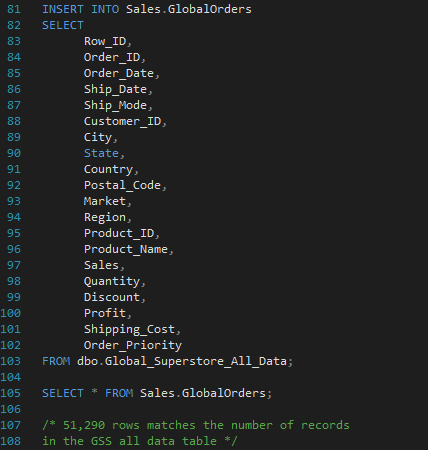
Create Sales Fact Table
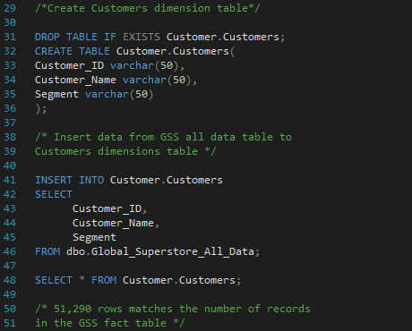
Customers Data Dimension Table
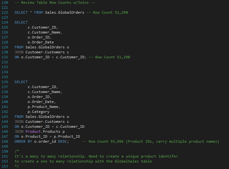
Reviewing Table Row Counts Joining with the Sales Fact Table
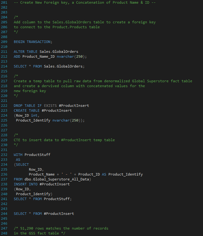
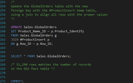
Creating a Foreign Key to Connect Sales and Product Tables
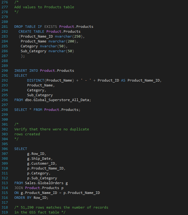
Create Product Table and Insert Data
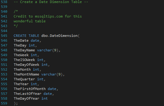
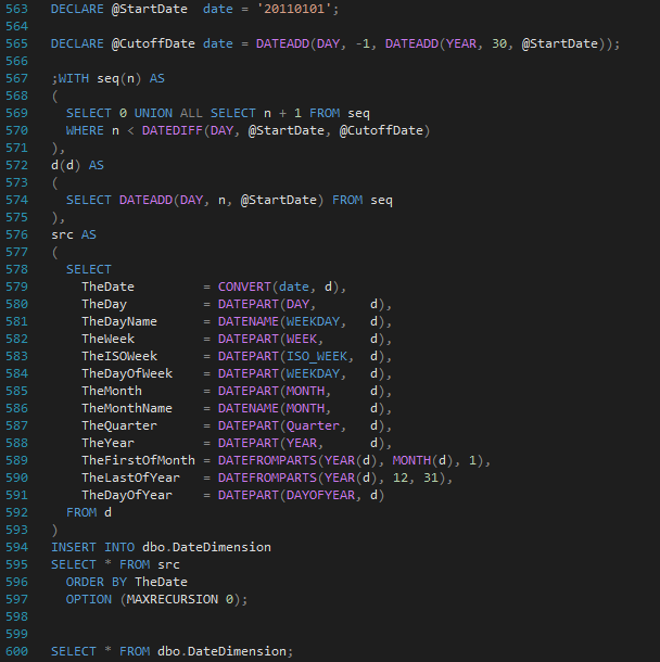
Create Date Dimension Table
(Thank you Aaron Bertrand at mssqltips.com for this code)
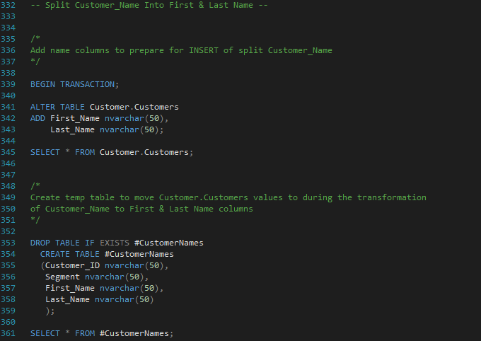
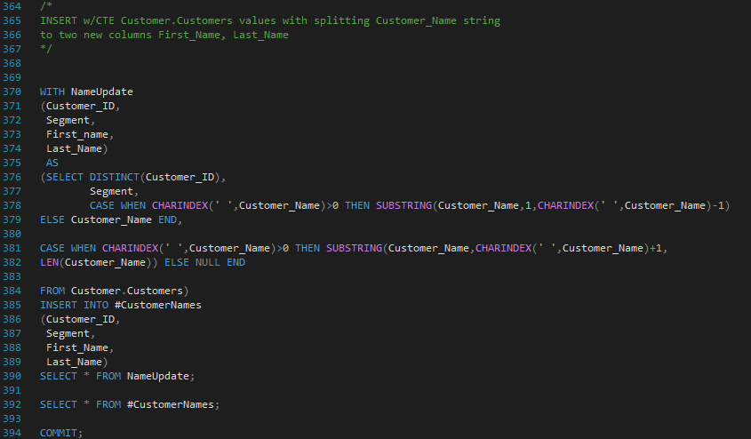
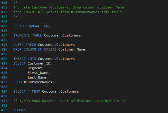
Split First and Last Customer Names
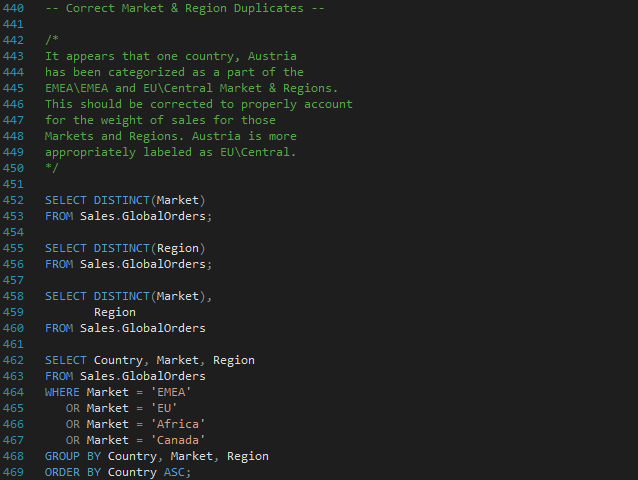
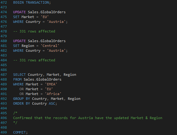
Update Sales Fact Table to Correct Inconsistencies
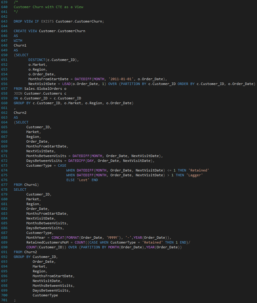
Customer Churn CTE Turned Into a View
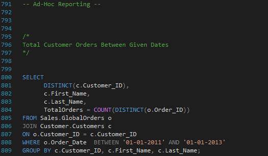
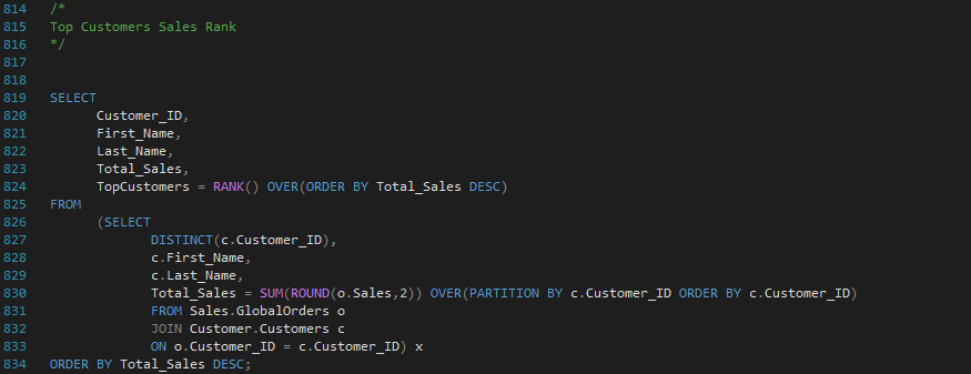
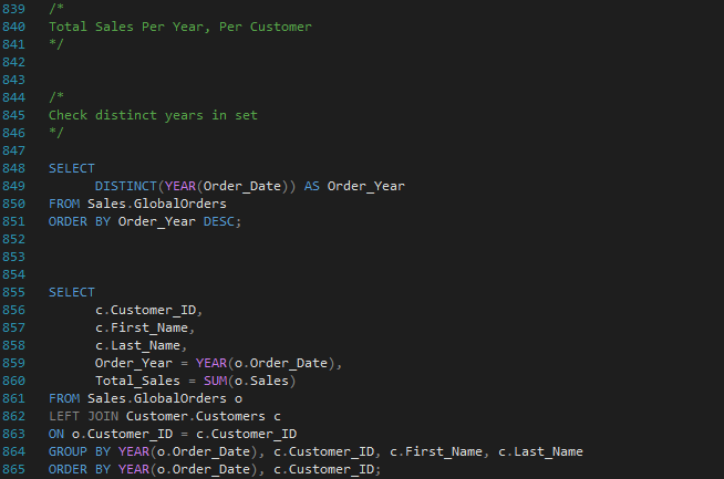
Ad-Hoc Reporting Examples
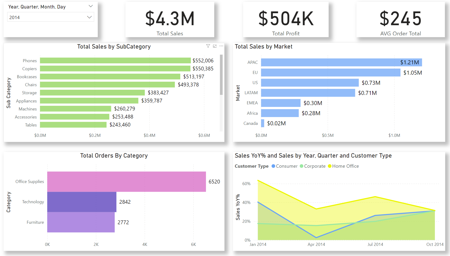
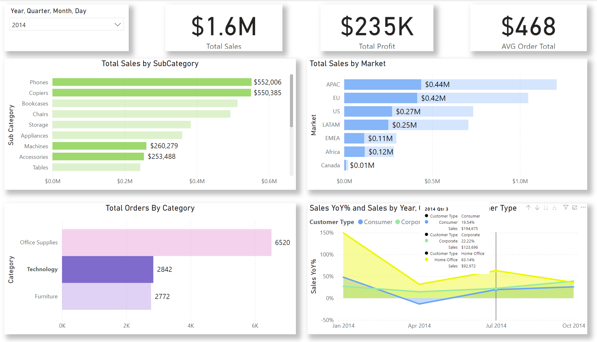
Global Super Store Visual Analysis
GSS KPIs Dashboard
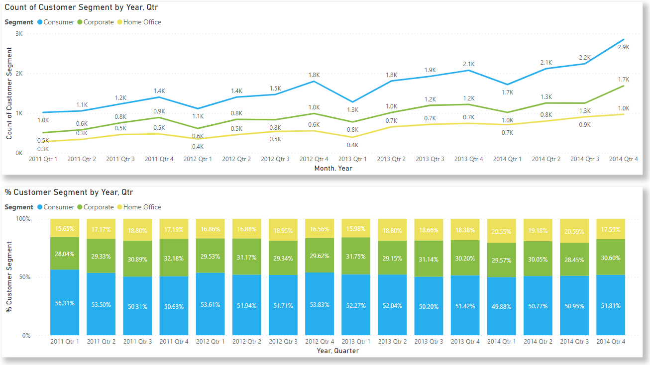
Customer Segment Review Report
Covering percentage and count of customer segments over time.
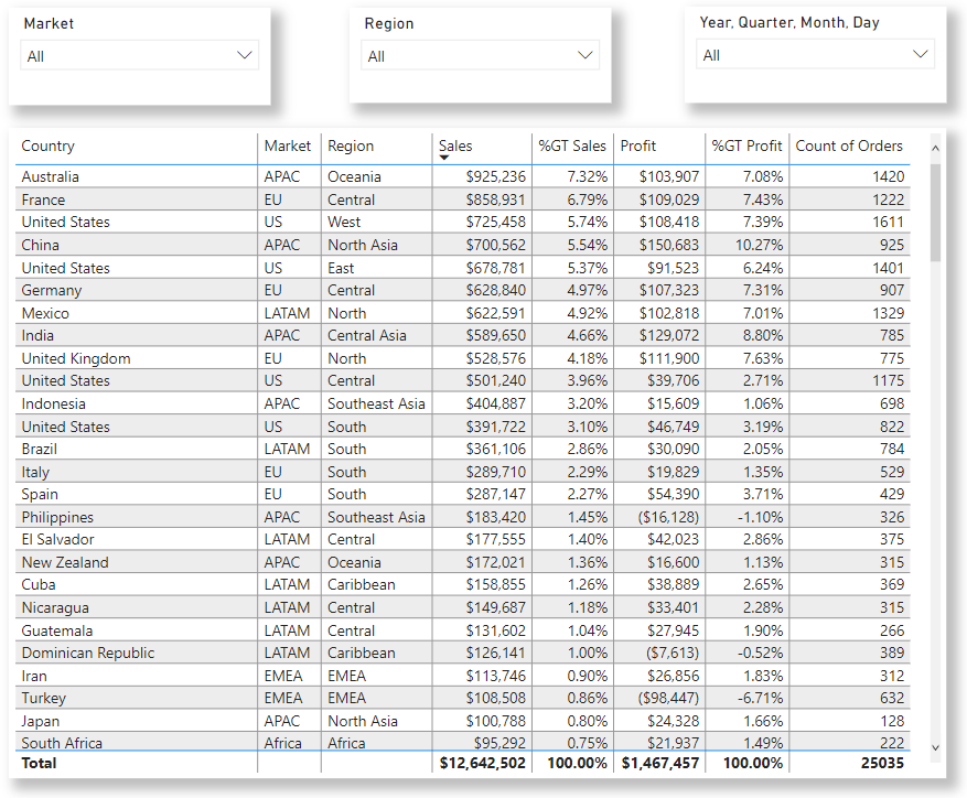
Sales and Profit Table Report
Showing profit and sales totals and percent of totals for country, market, and region.
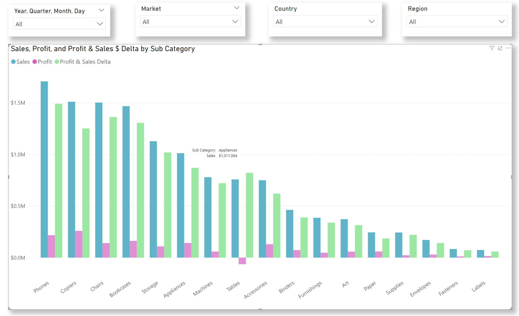
Sales and Profit with Delta by Subcategory Report
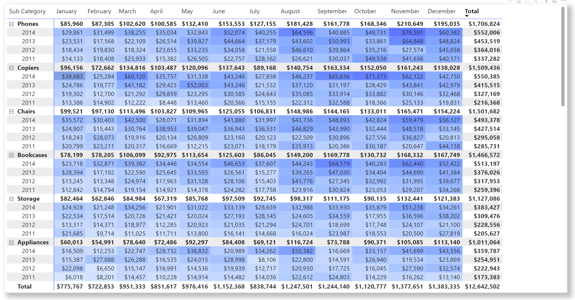
Subcategory Sales Matrix
Customer Churn Report
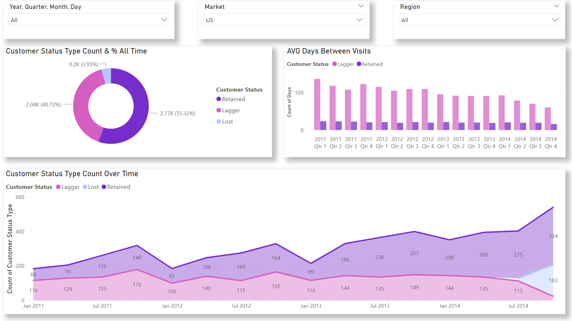
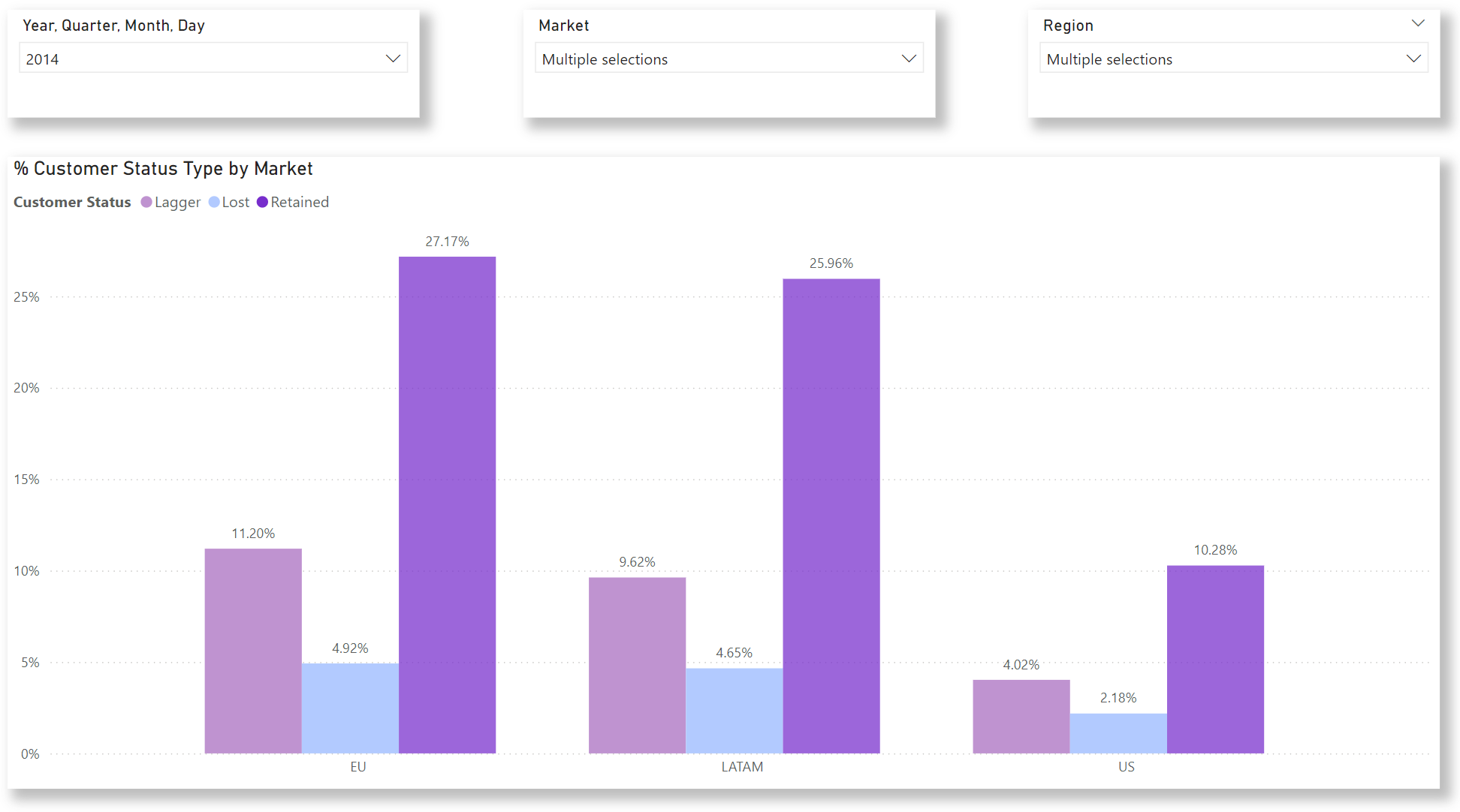
Customer Churn by Market and Region Report
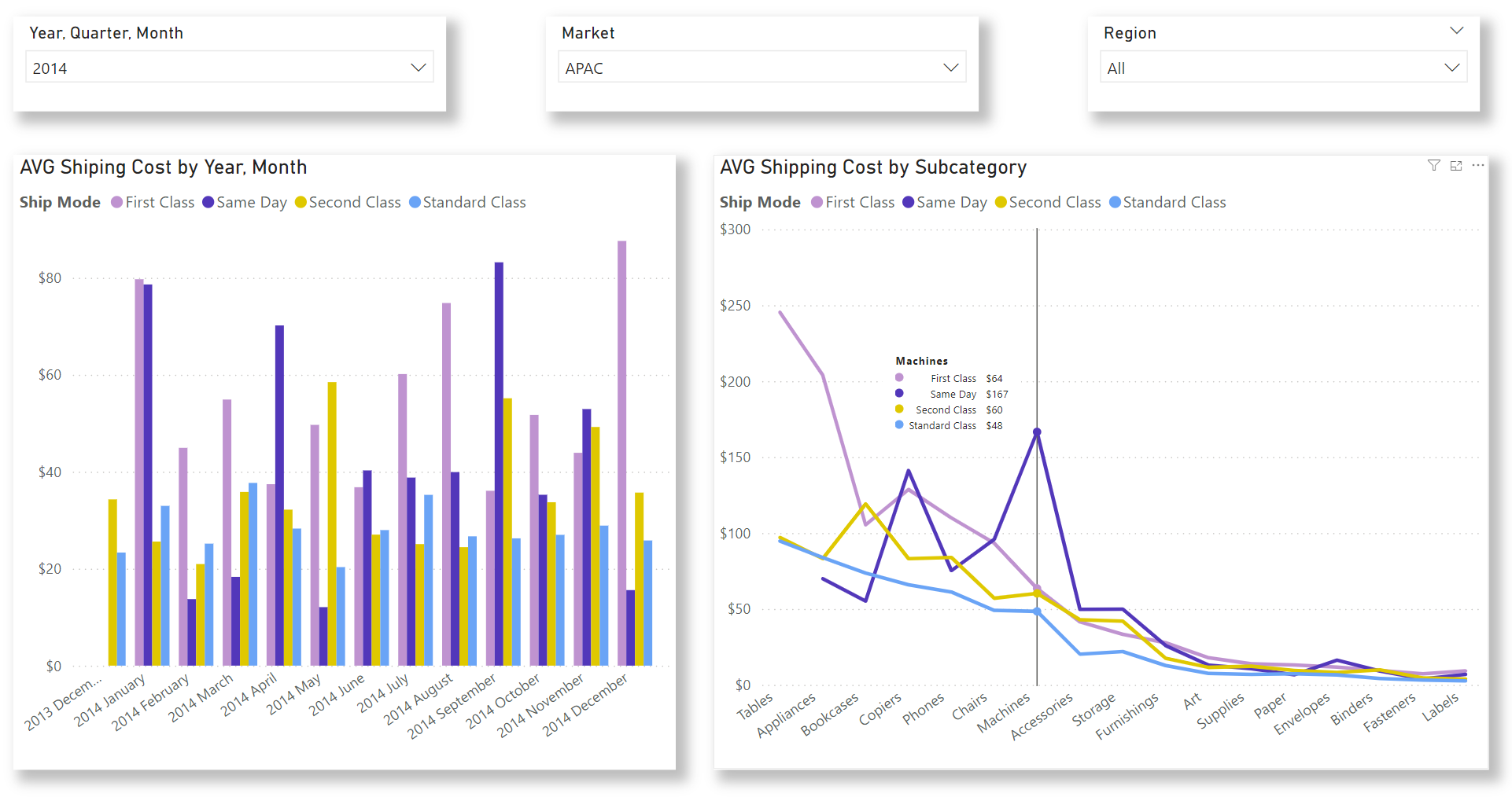
Count of Orders by Shipping Mode and Average Shipping Mode Cost Over Time

Average Shipping Cost of Shipping Mode and Subcategory Over Time, highlighting the Machines subcategory.